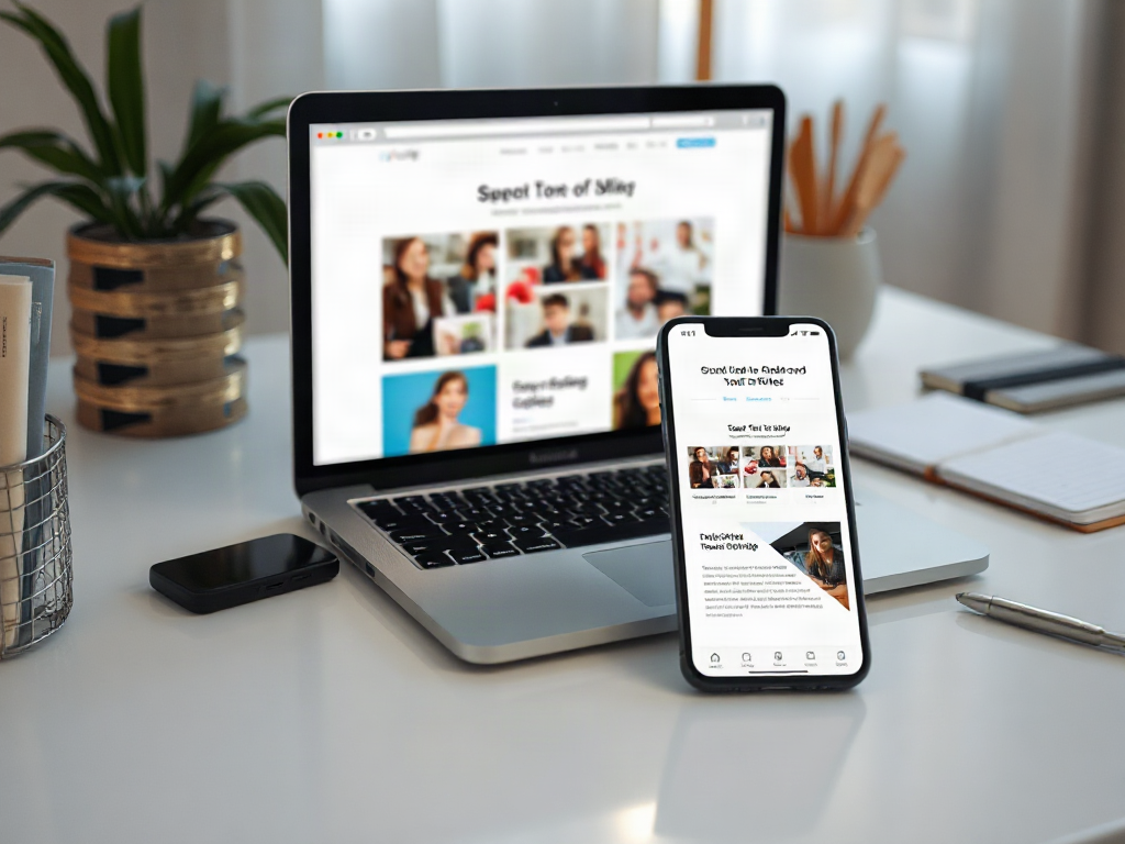
Website design choices for MLM opportunity marketing should make the offer understandable, verifiable, and easy to evaluate before asking a visitor to respond. Effective pages use a clear value proposition, realistic disclosure language, visible company identification, mobile-friendly layouts, and a single relevant call to action. Product information and opportunity details should remain distinct so visitors can tell what is being offered without interpreting exaggerated lifestyle imagery or vague income language. Fast loading, accessible forms, privacy information, and measured conversion paths improve usability while reducing avoidable trust and compliance risks.
What you’ll learn
This guide covers the following practical points:
- Clarify the Opportunity Before Styling the Page — A visitor should be able to identify the company, the product category, the nature of the opportunity, and the next step without scrolling through a long presentation.
- Build Credibility With Page-Level Evidence — Credibility comes from information a visitor can inspect, not from badges, stock photographs, or unsupported success language.
- Design a Focused Conversion Path — A focused page asks for one proportionate action at each stage of interest.
- Protect Mobile Usability, Speed, and Accessibility — Mobile design should be treated as the primary experience when traffic comes from social posts, messages, or email links.
Clarify the Opportunity Before Styling the Page
A visitor should be able to identify the company, the product category, the nature of the opportunity, and the next step without scrolling through a long presentation. That information hierarchy matters more than decorative effects. A visually polished page still fails when its headline promises freedom or transformation but never explains whether the visitor is considering a product purchase, an independent distributor role, or both.
Structure the first screen around a specific, factual proposition. The headline can identify the type of opportunity, while a short supporting paragraph explains the business activity in plain language. A nearby link or expandable section can provide company details, costs, eligibility conditions, and other material information that a prospect should review before submitting personal information.
Product demand and participation in the business should not be presented as the same decision. A product-focused visitor may want ingredients, features, pricing, or ordering details. An opportunity prospect needs to understand responsibilities, expenses, compensation documentation, and the absence of guaranteed results. Separate navigation paths prevent the page from using product interest as implied evidence that the business will suit every visitor.
A common mistake is replacing concrete information with a video and a prominent enrollment button. Video can explain a story, but it should not be the only route to essential facts. Visitors may be browsing without sound, using assistive technology, or unwilling to watch a lengthy presentation. Put the core meaning in readable text and use media as supporting material.
Build Credibility With Page-Level Evidence
Credibility comes from information a visitor can inspect, not from badges, stock photographs, or unsupported success language. Display the marketer’s identity, relationship to the company, reliable contact method, and links to relevant company policies. If the page collects information, explain what will happen after submission and provide access to a privacy notice.
Claims deserve especially careful treatment. Income screenshots, luxury imagery, countdown timers, and phrases suggesting predictable financial results can create an impression that qualifying language does not repair. Use only claims that can be supported and presented with appropriate context. When discussing earnings, costs, testimonials, or expected outcomes, follow the company’s current approved materials and obtain qualified compliance or legal guidance where needed.
Testimonials should not carry the entire argument. Even a genuine personal account may create a misleading expectation if it depicts an unusual outcome without sufficient context. A safer page emphasizes the actual work involved, customer-facing activity, ongoing costs, and factors that make results vary. The design should give disclosures comparable visibility rather than placing them in faint text below the footer.
Consider two page treatments. Version A shows a sports car, “replace your income” language, and a form requesting a phone number. Version B names the company relationship, explains the sales activity, links to official compensation information, states that outcomes vary, and tells the visitor who will contact them. Version B may attract fewer impulsive submissions, but the resulting inquiries are more likely to understand what they are requesting.
Design a Focused Conversion Path
A focused page asks for one proportionate action at each stage of interest. A new visitor may be ready to view official details or request an introductory conversation, but not to enroll immediately. Match the call to action to the amount of information already provided. “Review the opportunity details” is appropriate before a disclosure page; “Request a conversation” fits a form that clearly explains follow-up.
Keep initial forms short. Name, email address, and one optional qualifying field are often enough for an information request. Phone numbers, location details, and scheduling preferences should be requested only when they serve a stated purpose. Every additional field creates friction and increases the amount of personal data that must be handled responsibly.
The page hierarchy should make the next action obvious without repeating buttons after every paragraph. Use a prominent primary action and visually quieter secondary links for product details, company information, or policies. Multiple equal-weight buttons—join, buy, watch, call, message, and download—force the visitor to decide how the site works before deciding whether the opportunity is relevant.
A practical conversion sequence might look like this:
- Orientation: Identify the offer and the marketer’s relationship to it.
- Evaluation: Present responsibilities, costs, official documents, and realistic limitations.
- Response: Offer a clearly labeled form or scheduling option.
- Confirmation: State what was submitted, who will respond, and how to change communication preferences.
Measure more than completed forms. Visits to disclosure material, form abandonment, invalid contact information, and immediate unsubscribe requests reveal whether the page is creating informed interest. A high submission rate paired with confused follow-up conversations is evidence that the page is qualifying poorly, not that the sales team needs more pressure.
Protect Mobile Usability, Speed, and Accessibility
Mobile design should be treated as the primary experience when traffic comes from social posts, messages, or email links. Test the page at narrow widths and on an actual phone. Headings should wrap cleanly, buttons should remain easy to tap, forms should use readable labels, and disclosures should not disappear behind pop-ups or collapsed elements.
Speed affects both attention and comprehension. Large background videos, several tracking scripts, animation libraries, and oversized photographs can delay the information a prospect came to see. Compress images, limit decorative motion, reserve space for media to prevent layout shifts, and remove scripts that do not support a defined measurement or visitor function. A lightweight page also reduces the chance that someone on a slower connection abandons before seeing the offer.
Accessibility choices reinforce clarity. Use descriptive link text, keyboard-accessible controls, sufficient color contrast, visible focus indicators, alt text for meaningful images, and persistent labels above form fields. Do not convey risk, status, or required information through color alone. Captions and transcripts make recorded presentations usable when audio is unavailable.
The failure mode is assuming a responsive template has solved mobile and accessibility concerns. Templates can rearrange columns while leaving tiny disclosure text, intrusive sticky banners, unlabeled inputs, or menus that cannot be operated by keyboard. Test the completed page, including validation errors, consent controls, confirmation messages, and any embedded scheduling tool.
Evaluate the Page Before Publishing
A prepublication review should test whether a reasonable visitor receives enough context to make an informed next-step decision. Read the page without relying on the video, then inspect it again as a first-time mobile visitor. Ask someone unfamiliar with the offer to explain what the opportunity involves, what action the site requests, and what will happen afterward.
Use this compact design checklist:
- The company and marketer relationship are identifiable.
- Product information and participation details have separate, clear paths.
- Costs, responsibilities, limitations, and official documents are reasonably easy to find.
- Claims, images, testimonials, and disclosures create a consistent impression.
- The primary call to action matches the visitor’s stage of understanding.
- Forms collect only information needed for the stated follow-up.
- Mobile, keyboard, loading, error, and confirmation states have been tested.
After launch, compare page behavior with the quality of conversations it produces. Signs of a healthy design include visitors reaching substantive information, completing forms accurately, and arriving at follow-up conversations with realistic questions. Warning signs include repeated confusion about the company, surprise about costs, accidental submissions, rapid exits before content loads, or complaints about unexpected calls and messages.
Do not treat one button color or headline test as a complete optimization program. Changes that raise conversions while obscuring material information are not improvements. Favor tests that clarify the proposition, shorten unnecessary steps, improve page performance, or help visitors choose the correct path. Review the page whenever company materials, compensation documents, product terms, privacy practices, or contact procedures change.
Frequently Asked Questions
Should an MLM opportunity page include product information?
Yes, but product information should have a distinct path from business participation details. Visitors should be able to evaluate the products without treating a purchase as agreement to discuss or join the opportunity.
How many calls to action should the page use?
Use one primary action for the page's main purpose, supported by quieter links to official details and policies. Repeating the same action can be reasonable, but competing actions create avoidable confusion.
Should income claims appear on an MLM marketing website?
Do not publish income claims unless they are supportable, properly contextualized, and permitted under current company policies and applicable requirements. Qualified compliance or legal review may be appropriate before publication.
What information should an opportunity form request?
Request only the details required for the promised response, commonly a name and email address for an information inquiry. Explain how the information will be used before asking for a phone number or other personal data.
How can page performance be judged beyond lead volume?
Review lead accuracy, disclosure-page visits, form abandonment, follow-up questions, unsubscribe requests, and prospect confusion. These signals show whether the design produces informed interest rather than merely more submissions.
Conclusion
Strong MLM opportunity pages favor comprehension over spectacle. Establish a factual information hierarchy, separate product and participation paths, make material details easy to inspect, and request only a proportionate next step. Before sending traffic, test the full experience on a phone, review claims and disclosures together, and verify every form state. After launch, judge the design by informed conversations and accurate expectations—not form volume alone.